SF Justice Department
Team: Ahmad Sultan, Anna Lee, and me
Personal Contribution: data visualization, user research, web development
Date: Aug. - Dec. 2017
MISSION:
How can we help policymakers at SFJD effectively identify key trends in recidivism rates?


USER PERSONA & PRIMARY TASKS:
We began our research by arranging a phone call with our client. To prepare, we read through the dataset and codebook, and came up with a list of clarifying questions. Based on this initial interview, we were able to get a better sense of types of audience who would frequent our website. We generated three core personas, with a special focus on how frequent each of them would use the website.


To have a clearer framework of the problem, we also wanted to familiarize ourselves with current statistics and trends in recidivism. We created infographcis that we hope to guide first-time users who, like us, want to have some context before moving onto the statistical dashboards. We then generated preliminary sketches about what our Tableau dashboards would display. We decided to interact the relationships our client identified as the most interesting.
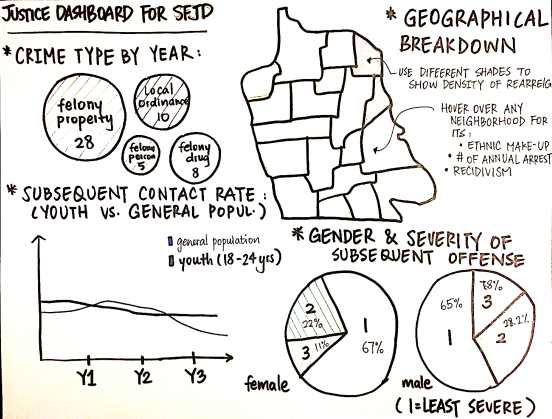
SKETCHES:

INITIAL PROTOTYPE:
Our first iterations involved choosing trends that our clients had highlighted, focusing on the color palette, while keeping our primary users in mind.
The Home page featured:
- a brief definition of recidivism and clear infographics for the general user
- and a tab that takes you immediately to the dashboards, which we assumed the researchers would make use of frequently.
The Dashboard page featured:
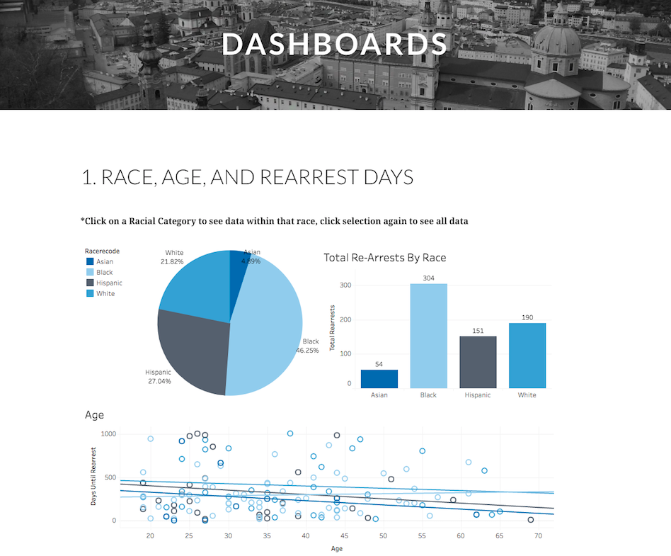
- captioned dashboards, comprising of different visualization techniques to illustrate recidivism's relationship with race, offense type, age, and gender.

USABILITY TESTING & FINDINGS:
To gather user feedback, we showed our initial visualizations to three participants. We wanted to know:
Whether the participants had:
- Prior knowledge about recidivism, and/or the criminal justice system
- Experience in statistical analysis
- Experience in navigating Tableau
How they perceive:
- The color palette of the website and dashboards
- The overall layout of the website
- The trends our dashboards tried to convey
Testing Methodologies:
- Virtual Google Hangout: screenshared current webiste
- Side-by-side navigation of website

INSIGHTS & ITERATION:
Based on the feedback received, we synthesized the insights into 3 areas for improvement:
- Start off with more broad observations, and allow the users to navigate and filter depending on the relationship they'd like to focus on
- Include statistics on recidivism rates at the city level
- Improve colors' usage in the dashboards to guide interpretation
We eventually decided on creating 4 dashboards using Tableau. For first-time users, we guide them through where to find the filtering options on each dashboard
FINAL DESIGN:


